RESEARCH (AUGUST 15-16 2019):
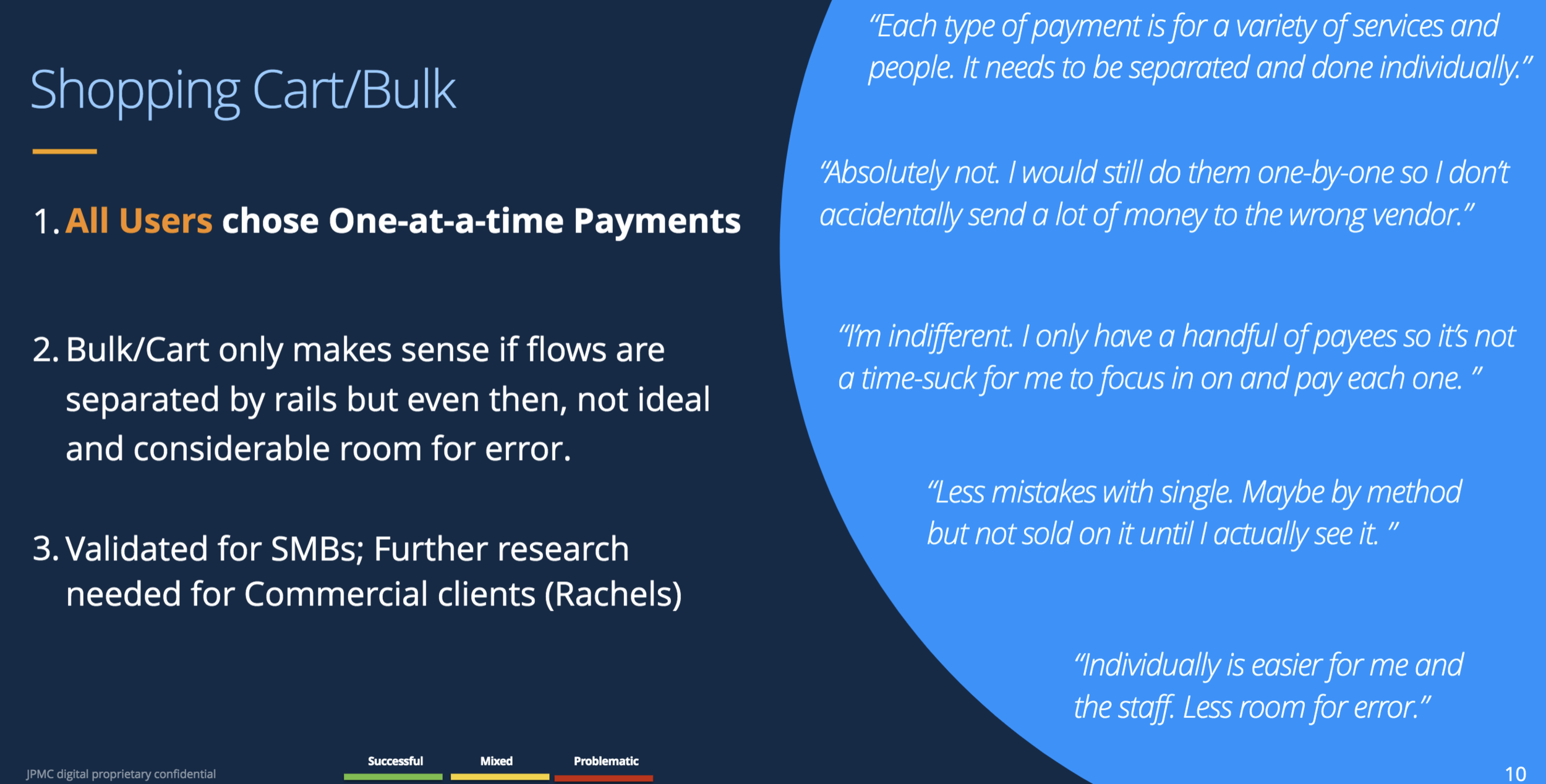
Most of our participants, small business owners, already banked with Chase Business. We tested usability through three prototypes, walked them through payment tasks, and asked them to detail their payments processes. These business owners are already experts with their accounting, often using tools like QuickBooks, and all preferred using computers than phones to minimize potential mistakes. The main product owner envisioned a shopping cart experience for users, but our participants emphatically told us that they always make payments one at a time because bulk payments leave room for error.
We discovered that the recipient list, as organized by payment method, is the ideal treatment. More than a few suggested to toggle between frequent and recent recipients. I noted that people chose “frequent recipients” over “top.” Information overload wasn’t an issue, but they did tell us which content pieces they thought were unnecessary. I also crowdsourced variations of payment taglines.
BEFORE & AFTER:
Product tile taglines, recipient list, segment lists, and the whole page, respectively, from August 2019 to February 2020.